
Ecommerce Hero Section Best Practices for 2026
A practical guide to ecommerce hero section best practices for 2026, covering copy, mobile layout, hero image speed, carousels and A/B testing on Shopify.
 Haroon Ali ShahNovember 18, 2026 · 10 min read
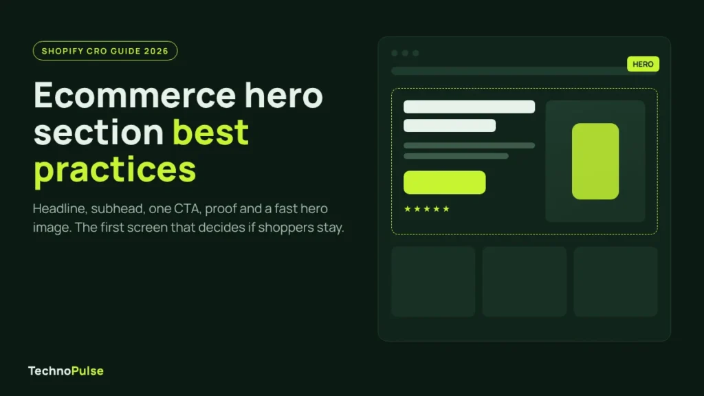
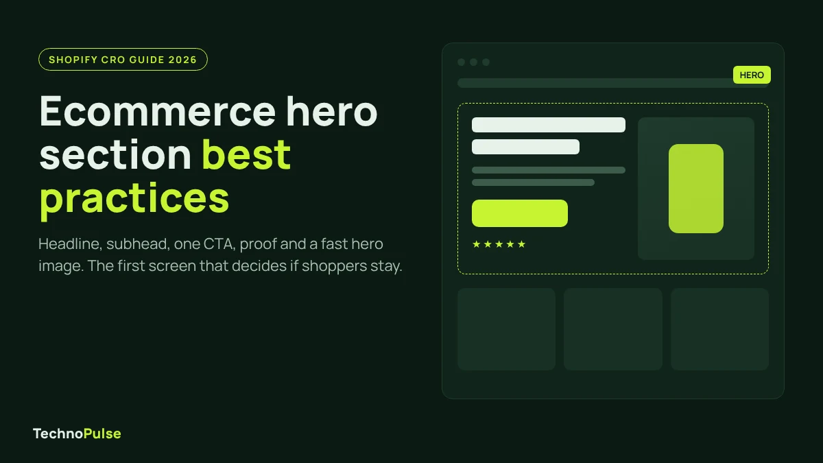
The best ecommerce hero sections in 2026 do one job: tell a new visitor what you sell, who it is for and where to click, all inside the first screen on a phone. That means one clear headline, a short subhead, a single primary CTA, a line of proof and one fast loading product image, with no rotating slider in the way.
Below is how we build and test that hero on Shopify stores, from copy and mobile layout to image speed and testing.
Why the hero section matters more than any other block
The hero is the first thing every homepage visitor sees, and it gets more attention than anything below it. In a 2018 eyetracking study, Nielsen Norman Group found that people spent 57 percent of their page viewing time above the fold, and 74 percent within the first two screenfuls. People do scroll, but they scroll because the top of the page convinced them it was worth it.
For a DTC brand, that first screen is also where paid traffic lands when you send ads to the homepage. If the hero is vague, slow or cluttered, you pay for clicks that bounce before they ever see a product. A clear hero does not fix a weak offer, but a weak hero can hide a strong one.
Ecommerce hero section best practices: the checklist
Use this as a quick audit of your current homepage. If you miss more than two, the hero is probably costing you sales.
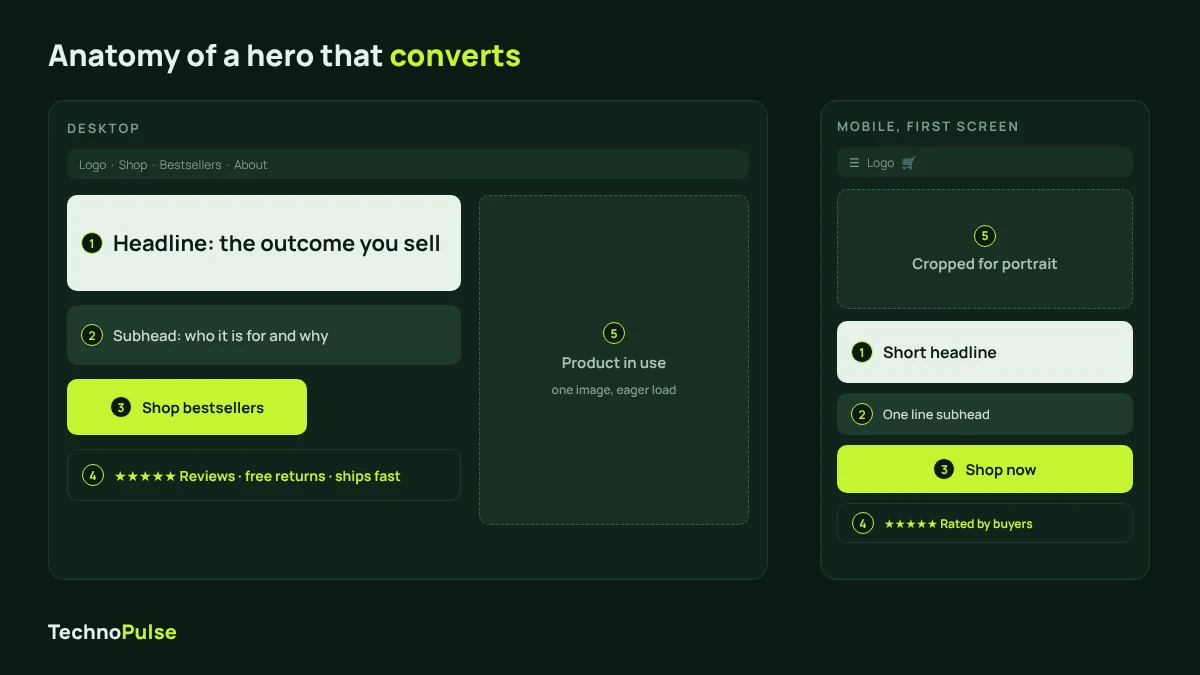
- One message. The headline names the outcome or the product category in plain words, not a slogan.
- A subhead that qualifies. One sentence on who it is for, what makes it different, or both.
- One primary CTA. A high contrast button with a specific label like “Shop bestsellers” or “Find your size”. A second link is fine if it is clearly quieter.
- Proof near the button. Star rating and review count, a press mention, or a short trust line about shipping and returns.
- A real product image. Show the product, ideally in use. Mood shots with no product make shoppers guess what you sell.
- Live text, not text in the image. Headlines baked into a JPG are blurry on some screens, cannot be read by screen readers and are painful to test.
- Mobile first layout. Headline and CTA visible on a phone without scrolling.
- Fast image. The hero image is often the Largest Contentful Paint element, so it must load first, not last.
- Static over slider. One strong message beats five rotating ones.
- Clear path into the catalog. The section right below the hero shows your main categories or bestsellers, so people can see your range.
For the rest of the store, our Shopify CRO checklist covers product pages, cart and checkout in the same format.
The hero copy formula: headline, subhead, CTA, proof
Most hero sections fail on words, not design. Here is the formula we use on client stores.
Headline: say what you sell or what it does
Write the headline so a stranger who has never heard of your brand understands it in one read. “Camping gear built for real weather” works. “Adventure awaits” does not, because it could be a travel site, a bank or a shoe brand. Keep it under about ten words so it fits on two lines on a phone.
Subhead: give a reason to care
The subhead adds the detail the headline left out: the main benefit, who it is for, or what makes you different from the cheaper option on Amazon. One sentence. If you need two, the headline is not doing its job.
One primary CTA
Pick the single action you want most visitors to take and make it the only bright button in the hero. Label it with what happens next: “Shop the collection”, “Take the quiz”, “Shop bestsellers”. Avoid “Learn more” on a store homepage; people came to buy or browse, not to read. Send the button to the page with the best conversion rate for cold traffic, which is often a bestsellers collection rather than the full catalog.
Proof: one line, close to the button
Put a short trust signal right next to or under the CTA. A star rating with a review count is the strongest for most DTC brands. Free shipping thresholds, return windows and press logos also work. Keep it to one line. Proof that sits in a separate section three scrolls down does nothing for the visitor deciding whether to click right now.
Designing the mobile hero
For many DTC stores most sessions come from phones, so design the mobile hero first and scale up. Check your own analytics split before you design anything.
- Keep the CTA on the first screen. Open your homepage on a real phone. If you have to scroll to see the button, the image is too tall or the headline is too long.
- Use a separate mobile crop. A wide desktop banner squeezed onto a phone shrinks the product into a tiny strip. Many Shopify themes let you upload a different image for mobile, or you can set a focal point. Use it.
- Stack, do not overlay. Text laid over a busy photo is hard to read on a small screen. Placing the headline and button under the image is often cleaner and easier to read.
- Mind the announcement bar. A tall promo bar plus a sticky header can eat a big chunk of the first screen. Keep the bar to one line.
Hero image speed and LCP
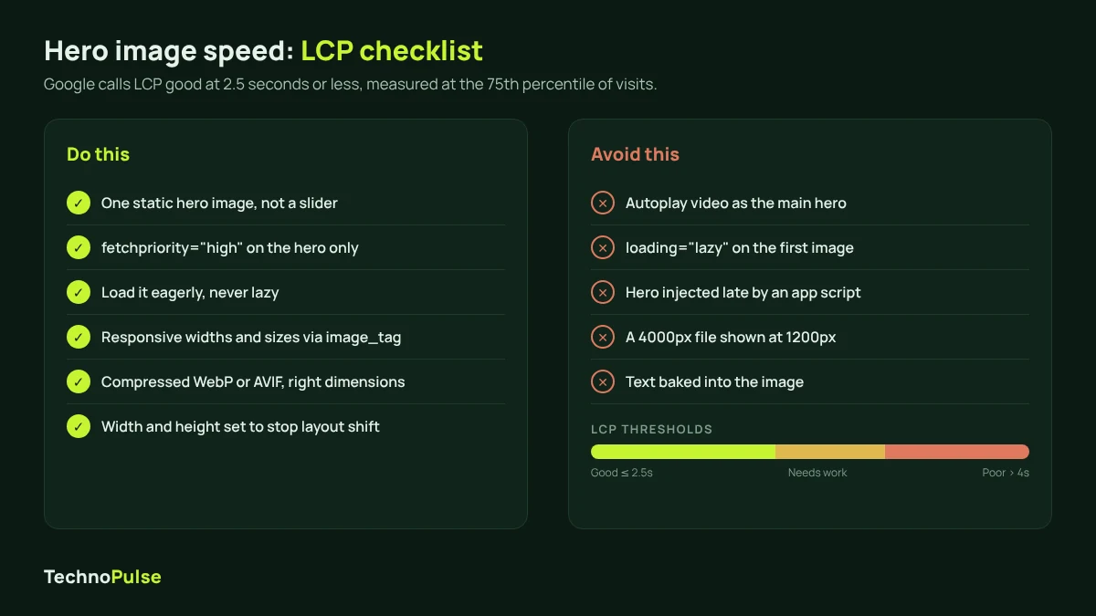
On most homepages the hero image is the Largest Contentful Paint element, the metric Google uses to judge how fast the main content shows up. Google’s web.dev guidance says a good LCP is 2.5 seconds or less, measured at the 75th percentile of page loads, with mobile and desktop checked separately. A slow hero means shoppers stare at a blank box while you pay for the click.
Here is what moves the needle on Shopify:
- Do not lazy load the hero. Lazy loading is great for images further down the page, but on the first image it delays the most important pixel on the screen. Shopify’s own theme guidance on setting fetchpriority on the LCP image says never to combine high priority with
loading="lazy". - Add
fetchpriority="high"to the hero image only. Shopify recommends it on one image per page, the LCP image, and warns that overusing it can hurt performance. In a web.dev case study, raising the priority of the LCP image on Google Flights improved LCP from 2.6 seconds to 1.9 seconds. - Serve responsive sizes. Use the
image_tagfilter withwidthsandsizesso a phone downloads a phone sized file, not your full desktop banner. - Compress and resize before upload. Export at the size you need; a huge camera file shown small just wastes bandwidth.
- Set width and height. This reserves the space and stops the page from jumping as the image loads.
- Be careful with video heroes. Video is heavy, so make sure the poster frame is a strong still that works on its own.
If your hero is fast but the page is still slow, apps and scripts are usually the cause. Our guide on how to speed up a Shopify store walks through the full list.
Thinking about a full headless rebuild to get a faster hero? Most hero speed problems are fixed on the existing theme. Read when headless Shopify pays off before you commit to one.
Carousel vs static hero
Rotating carousels are still common, and they still underperform. Baymard Institute’s research found that 33 percent of ecommerce sites have a homepage carousel, and 46 percent of those carousels have usability issues. Nielsen Norman Group’s mobile research adds that most people stop after viewing three or four carousel items, and that in one test, people who scrolled past a large self animated hero did not notice it rotating at all.
The other problem is focus. A carousel usually exists because five teams each wanted the top spot. The result is five messages, none of which gets a fair shot. Moving, promo style banners at the top of a page are also exactly what people have trained themselves to ignore, a habit known as banner blindness.
Our default is simple: one static hero with your strongest message. If you have more to say, put it in static blocks below the hero where shoppers can scroll at their own pace. If you must keep a slider, turn off autoplay, keep it to a few slides, make the controls easy to see and make sure slide one can carry the page on its own.
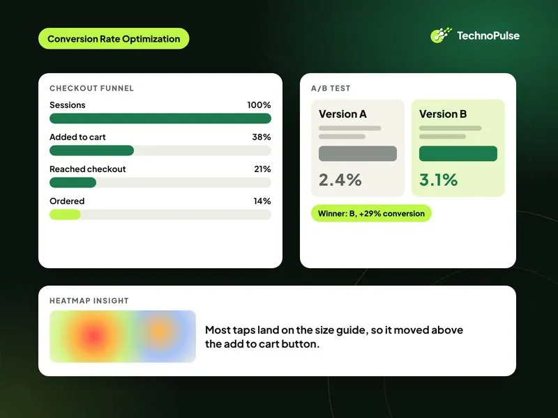
How to A/B test your hero section
The hero is one of the best places to start testing because every homepage visitor sees it. A few rules keep tests useful:
- Test one big idea at a time. Headline angle, product image versus lifestyle image, or CTA destination. Changing the button color is rarely worth the traffic.
- Measure the right goal. Hero click rate is a nice signal, but judge winners on add to cart rate, conversion rate and revenue per visitor.
- Split by device. A hero that wins on desktop can lose on mobile. Read results for each.
- Run full weeks. Let tests cover at least one or two full weekly cycles so weekday and weekend shoppers are both counted, and do not stop the test the first day it looks good.
- Watch speed. Some testing tools swap content after the page loads, which can cause flicker and slow the hero. Check LCP on both versions.
Low traffic store? Make bigger, research backed changes instead, like a headline rewritten from customer reviews, then compare conversion rate before and after over a similar period.
Common hero section mistakes
- Clever headline, no meaning. If a new visitor cannot tell what you sell, the hero has failed.
- Three buttons of equal weight. Shop men, shop women, shop sale, take quiz. When everything is primary, nothing is.
- Sale banner as the permanent hero. Discounts belong in the announcement bar or a timed slot, not as your brand’s first impression all year.
- Desktop image on mobile. The product ends up tiny or cropped out.
- A slow, lazy loaded or app injected hero. The shopper sees an empty block first.
- No path to the catalog. Baymard also found that some shoppers leave when they cannot see the product type they want, so show your main categories right below the hero.
What this looks like on a real store
For one outdoor gear brand we worked with, the homepage was one part of a wider Shopify project. The brand grew online sales 5.8x and lifted conversion by 49 percent. You can read the full outdoor camping gear Shopify case study to see how the pieces fit together.
TechnoPulse is a Shopify Partner and Klaviyo Partner. We have helped 200+ DTC brands since 2021 and hold a 5.0 rating on Google from 40+ reviews. If you want a team to own this end to end, our Shopify CRO agency service covers research, design and testing.
Frequently asked questions
What should an ecommerce hero section include?
A clear headline that says what you sell, a one sentence subhead, one primary CTA button, a short line of proof such as star ratings, and a fast loading image that shows the product. Everything else can live further down the page.
Is a carousel or a static hero better for a Shopify store?
A static hero is the safer choice for most stores. Research from Baymard and Nielsen Norman Group shows carousels often have usability problems and most visitors never see the later slides. Put extra messages in static sections below the hero instead.
How fast should my hero image load?
Aim for a Largest Contentful Paint of 2.5 seconds or less for at least 75 percent of visits, which is Google’s threshold for a good score. Do not lazy load the hero, give it high fetch priority and serve responsive sizes.
Where should the hero CTA link to?
Link it to the page that converts cold visitors best, which is often a bestsellers collection or a product finder quiz. Check your analytics for the collection with the highest conversion rate from homepage traffic.
How do I know if my hero section is working?
Look at homepage bounce rate, clicks on the hero CTA and conversion rate from homepage sessions, split by mobile and desktop. Then run an A/B test on one big change, such as the headline, and judge it on revenue per visitor.
Get a free hero and homepage review
Not sure what is holding your homepage back? Request a free Shopify store audit and we will review your hero, mobile layout, speed and conversion path, then send you a prioritized list of fixes.

Founder and CEO of TechnoPulse. Leads Shopify development, CRO and growth strategy for DTC brands in the US, Europe and Australia.
More about Haroon