

Shopify Product Page Optimization: 2026 Guide
A 7 step Shopify product page optimization guide: what to fix first, the Shopify settings to use, Baymard research, and how to measure the lift.
 Haroon Ali ShahNovember 9, 2026 · 8 min read

Shopify product page optimization means fixing the few things that stop a ready shopper from adding to cart: images that show scale, a clear price and total cost, easy variant buttons, returns and delivery near the buy button, and reviews that answer doubts. Start with the issues your own data shows on mobile, fix them in priority order, and measure add to cart rate per product page, not just store conversion.
We have helped 200+ DTC brands since 2021, and when I audit a product page the pattern is almost always the same. Founders spend weeks on the home page while the product page, where the buying decision actually happens, still runs the theme defaults. This guide is the order I work in, with the Shopify settings to use and the research behind each step.
Why product pages are where Shopify stores lose sales
Baymard Institute benchmarks product page UX across more than 155 large ecommerce sites. In its current state of product page UX report, 52 percent of desktop sites and 62 percent of mobile sites rate mediocre or worse. If the biggest retailers with full UX teams get this wrong, a Shopify store running a theme demo layout almost certainly does too.
The same research shows where it goes wrong:
- 37 percent of sites have no image that shows the product in scale, yet 42 percent of shoppers try to judge size from the images.
- 57 percent of sites do not use buttons for size selection.
- 67 percent give no estimate of the total order cost near the buy section.
- 44 percent do not show or link the return policy in the main product content, while 60 percent of shoppers look for it there.
- 89 percent do not respond to negative reviews.
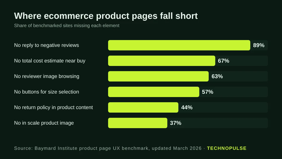
Each of those is a doubt the shopper cannot resolve on the page. When a doubt goes unanswered, they leave to check Amazon, a review site or a competitor, and most do not come back.
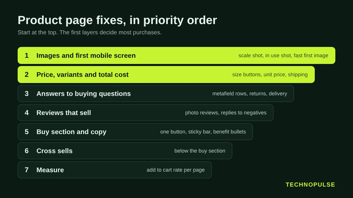
Step 1: Find which product pages to fix first
Do not optimize every product at once. Pick the pages where a lift moves revenue.
- In Shopify Analytics, open the sessions by landing page report and the products report. List your top 10 products by sessions over the last 90 days.
- For each one, note sessions, add to cart rate and conversion rate. Add to cart rate is the cleanest product page metric because checkout problems do not distort it.
- Split mobile and desktop. A product with a healthy desktop add to cart rate and a weak mobile one has a layout problem, not a product problem.
- Rank by sessions multiplied by the gap between that page’s add to cart rate and your store median. The top three are your first sprint.
One caution: Shopify changed how it counts sessions in September 2026, so compare like with like. Our guide to the Shopify session update explains what moved and how to read trends across the change.
Step 2: Fix the images and the first screen on mobile
On a phone, the first screen is the gallery, the title, the price and ideally the add to cart button. Everything else is a scroll away.
- Lead with the clearest product shot, then add an in scale image (in a hand, on a person, next to a common object) within the first three images.
- Add a human model or in use image for anything worn, held or used. Baymard found 23 percent of sites skip this.
- Keep the gallery swipeable and show a count or dots so shoppers know there are more images.
- Compress and size images properly. Shopify serves images through its CDN in modern formats; the job is uploading sensible source files and making sure the first image is not lazy loaded. Our Shopify speed guide covers the theme side.
- Give every image descriptive alt text such as “waterproof hiking jacket in olive, front view”. It helps accessibility and image search.
Step 3: Make price, variants and total cost obvious
Shoppers decide on cost before they decide on anything else, so remove every surprise.
- Use buttons, not dropdowns, for sizes and colors. In most Shopify 2.0 themes this is a setting on the variant picker block: switch the style from dropdown to pills or buttons. Show sold out sizes as crossed out, not hidden.
- Show price per unit for multipacks and bundles. Shopify supports unit prices on variants for many markets.
- State shipping cost or the free shipping threshold under the price, and show estimated delivery dates if your carrier data supports it.
- Show the saving clearly on discounted items, with the compare at price crossed out. Only use real compare at prices.
Step 4: Answer the questions that stop the purchase
Read your support inbox, chat logs and one star reviews for the product. The same five or six questions appear again and again: sizing, materials, how it works, delivery time, returns. Answer them on the page, close to the buy button.
The cleanest way to do this in Shopify is with metafields, so each product gets its own answers without editing the theme for every product. Shopify’s own metafields tutorial shows the flow:
- Go to Settings, then Metafields and metaobjects, then Product metafields, and add a definition such as Size guide, Materials or Care.
- Fill in the field on each product.
- In the theme editor, open the default product template, add a collapsible row block, and connect its content to the metafield with the dynamic source icon.
Put the return policy summary in one of those rows, in plain words: how many days, who pays return shipping, and how refunds work. Then add the same policy to Google. Google supports return policy and shipping details in product structured data, and Search Console lets you set shipping and returns for your site, which can show those details in search results before the click.
Step 5: Make reviews do the selling
- Show the star rating and review count next to the title, linked to the reviews section.
- Let shoppers filter and browse photo reviews. Baymard found 63 percent of sites do not let users move across reviewer images, which are often the most persuasive images on the page.
- Reply to negative reviews with a fix, not a script. A calm reply to a one star review builds more trust than ten five star reviews.
- Ask for reviews at the right moment. A post purchase flow timed after delivery gets more and better reviews. Our post purchase email guide covers the timing.
Step 6: Tighten the buy section and the copy
- One primary button with clear copy such as Add to cart. Keep accelerated checkout buttons below it if you use them.
- Add a sticky add to cart bar on mobile once the main button scrolls out of view. Many themes include it as a setting.
- Write benefit first copy: three to five short bullets on what the product does for the buyer, then the detail below for those who want it.
- Remove distractions near the buy button: countdown timers that reset, fake stock warnings and popups on page load all cost trust.
Step 7: Add cross sells after the main decision
Shopify’s built in product recommendations, or a complementary products block fed by the Search and Discovery app, can add order value. Place them below the buy section, not above it. The shopper should finish the first decision before you offer a second.
How to test product page changes properly
Most stores do not have enough traffic for clean A/B tests on small changes, and that is fine. Here is the honest maths. At a 2 percent conversion rate, detecting a 20 percent relative lift with 95 percent confidence and 80 percent power needs about 21,000 visitors per variant. Detecting a 10 percent lift needs about 80,000 per variant.
So use two modes. For clear UX fixes backed by research, such as size buttons, return policy near the button or in scale images, ship them and watch add to cart rate over the next four weeks against the same weeks before. For bigger, uncertain changes such as a new layout, pricing display or bundle offer, run a proper test on your highest traffic product. Our conversion optimization process explains how we pick tests.
A product page checklist you can run today
- First image is the clearest product shot and is not lazy loaded
- An in scale and an in use image are in the first three
- Variants are buttons, sold out sizes are visible but crossed out
- Price, unit price where relevant, and shipping cost or threshold sit together
- Delivery estimate and return policy summary are next to the button
- Top five customer questions answered in collapsible rows from metafields
- Star rating near the title, photo reviews browsable, negative reviews answered
- Sticky add to cart on mobile
- Cross sells below the buy section
- Product structured data valid in the Rich Results Test
For the wider store, our Shopify CRO checklist covers navigation, cart and checkout, and our guide to what a good Shopify conversion rate is helps you set a realistic target.
What this looks like in practice
Product page work rarely happens alone. For DOD Outdoors, a camping gear brand selling across the US, we reordered collections around launches and best sellers and tightened product pages for faster decisions. Online sales grew 5.8x and conversion rose 49 percent in year one. You can read the full outdoor gear case study to see the before and after.
FAQ
What should be on a Shopify product page?
Clear images including one in scale, the title, price and any unit price, variant buttons, shipping cost or threshold, a delivery estimate, a return policy summary, the add to cart button, benefit led copy, answers to common questions, and reviews with photos.
What is a good add to cart rate on Shopify?
It varies widely by price point and traffic source, so the most useful benchmark is your own store median. Rank product pages against that median and fix the pages with high traffic and a below median rate first.
Should I use dropdowns or buttons for variants?
Buttons. They show every option at a glance and need one tap instead of two. Most Shopify 2.0 themes let you switch the variant picker style in the theme editor without code.
Do product page changes help SEO too?
Yes. Unique descriptions, descriptive alt text, valid product structured data with return and shipping details, and a fast first image all help product pages rank and earn richer results in Google. The same product data feeds your Google Shopping listings, which is where our ecommerce PPC work starts.
How long until I see results?
Clear UX fixes usually show in add to cart rate within two to four weeks on products with steady traffic. Compare the same weekdays and traffic mix before and after, and watch for sales or ad changes that skew the numbers.
Get your product pages reviewed
If you want a second pair of eyes, our Shopify CRO team will review your top product pages as part of a free store audit and send back a prioritized fix list. We are a Shopify Partner and Klaviyo Partner rated 5.0 on Google from 40+ client reviews. Request your free store audit.

Founder and CEO of TechnoPulse. Leads Shopify development, CRO and growth strategy for DTC brands in the US, Europe and Australia.
More about Haroon